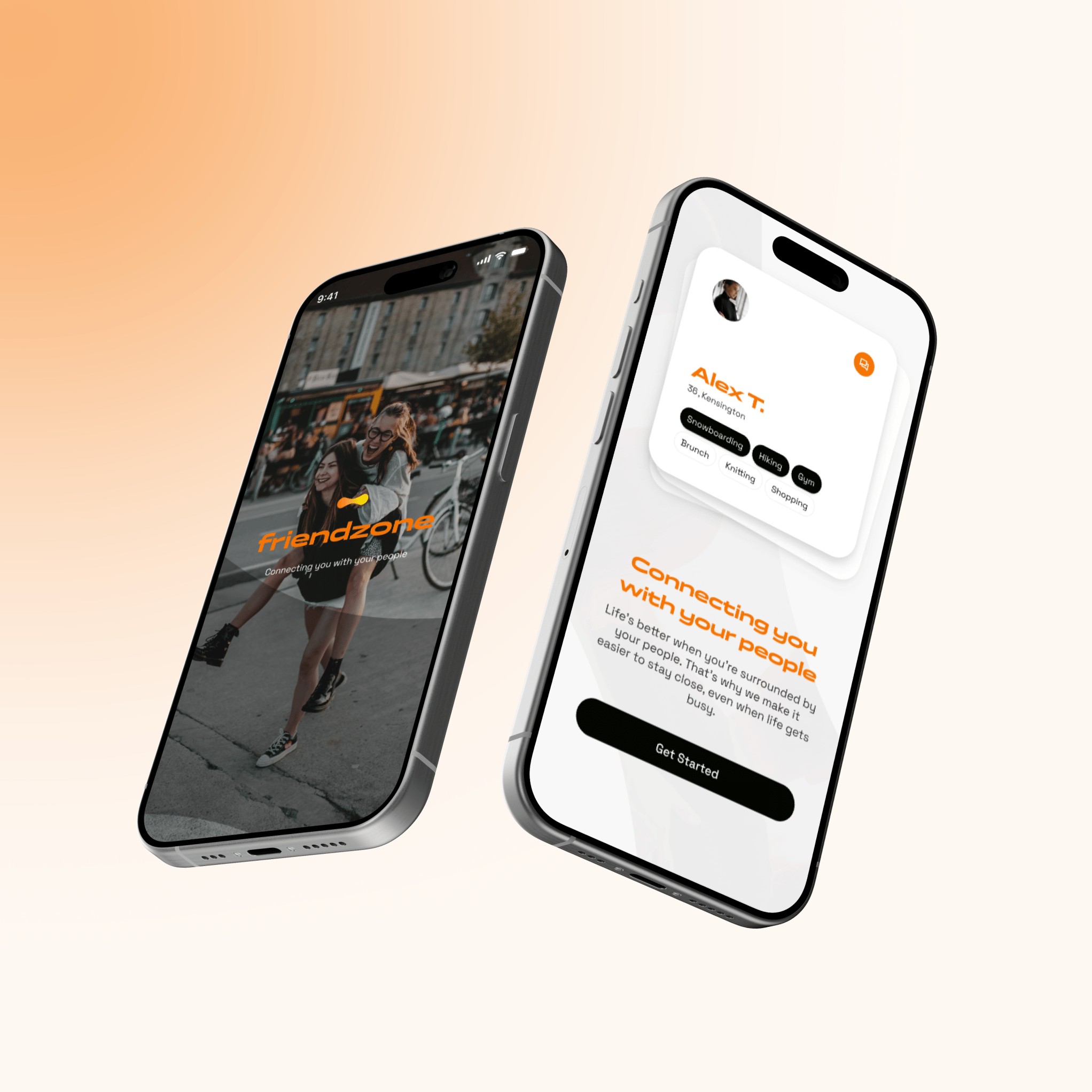
FriendZone
UX/UI Product Designer
April, 2025

link
Overview
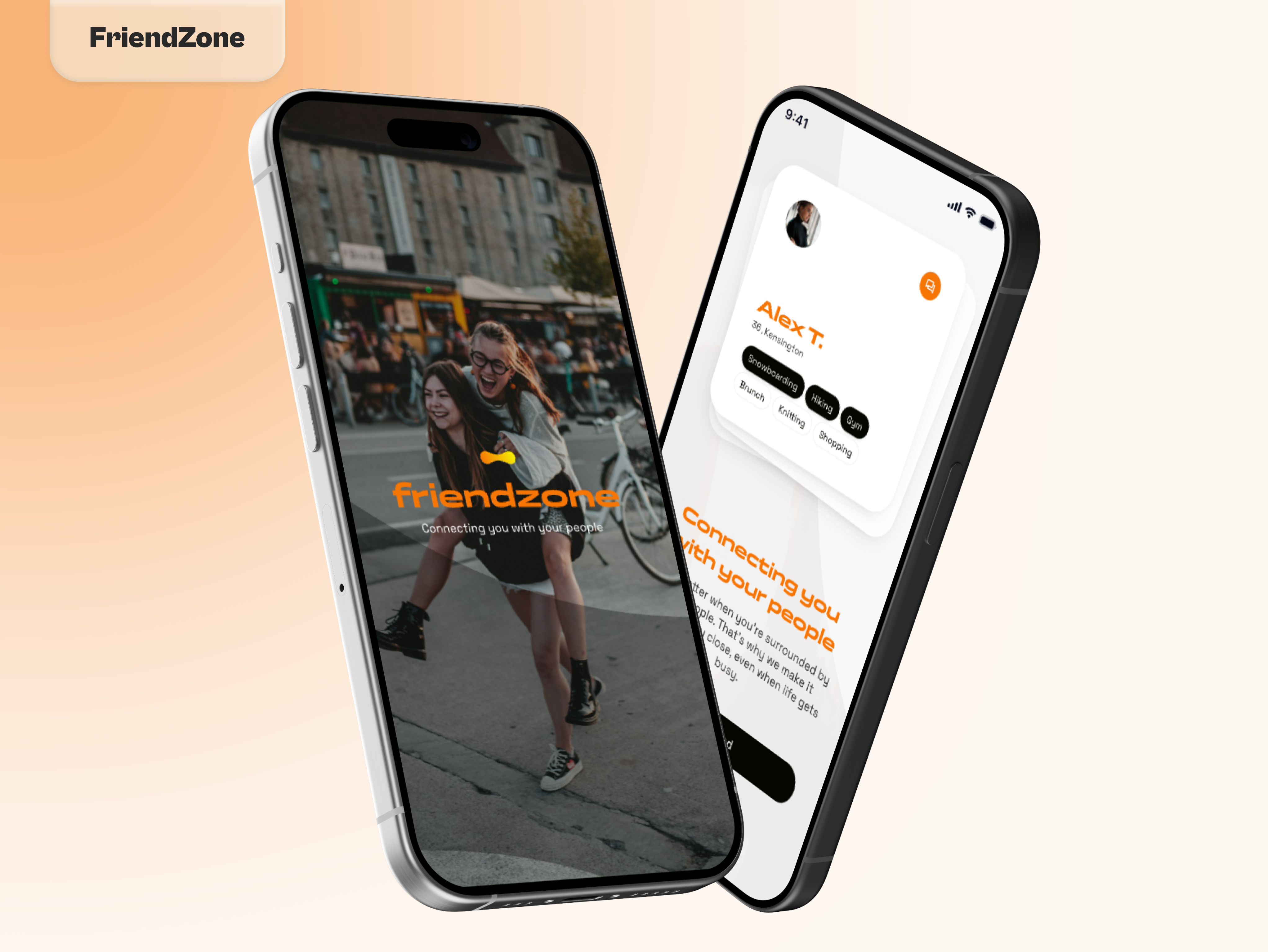
FriendZone set out to become the first truly social network for adults, one designed around real-life friendships, not follower counts. The client’s goal was to create a platform where people could build meaningful, safe, and interest-based connections through shared activities and vetted venues.
The challenge: combat adult loneliness, modern disconnection, and the lack of genuine spaces for new friendships, especially post-30.
The Project Scope
Considering that we started from scratch for this project, our main goals were:
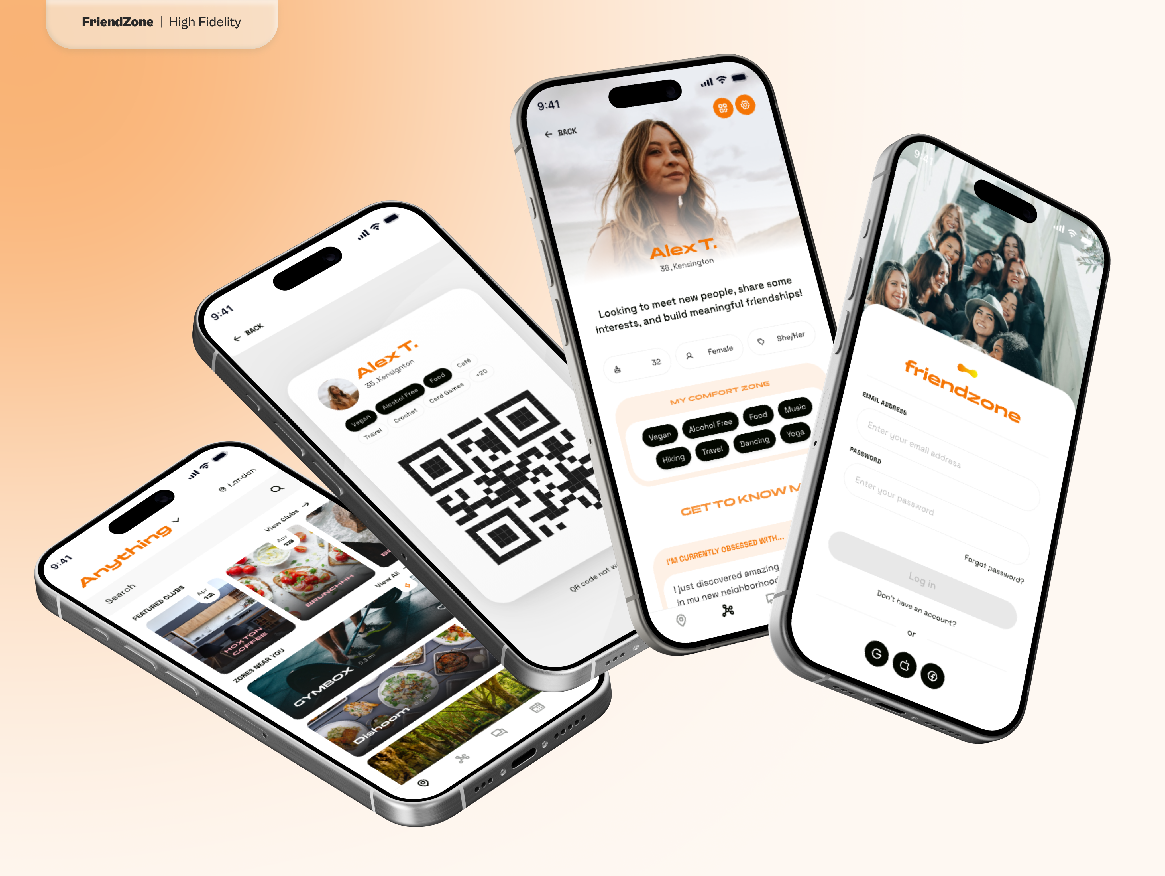
- Defining the product architecture and tag system, identified as Topics, Interest Zones, and Comfort Zones
- Designing user journeys for meeting new people in safe, interest-driven ways
- Creating flows for key features like matching, messaging, venue discovery, safety tools, and the unique Bored Blast
- Developing a brand tone that is warm, respectful, and empowering
- Delivering wireframes and high-fidelity screens ready for development
FriendZone
UX/UI Product Designer
April, 2025
link
Overview
FriendZone set out to become the first truly social network for adults, one designed around real-life friendships, not follower counts. The client’s goal was to create a platform where people could build meaningful, safe, and interest-based connections through shared activities and vetted venues.
The challenge: combat adult loneliness, modern disconnection, and the lack of genuine spaces for new friendships, especially post-30.
The Project Scope
Considering that we started from scratch for this project, our main goals were:
- Defining the product architecture and tag system, identified as Topics, Interest Zones, and Comfort Zones
- Designing user journeys for meeting new people in safe, interest-driven ways
- Creating flows for key features like matching, messaging, venue discovery, safety tools, and the unique Bored Blast
- Developing a brand tone that is warm, respectful, and empowering
- Delivering wireframes and high-fidelity screens ready for development