Zera
UX/UI Product Designer, Consultant
November, 2024

link
Overview
Zera is an app that offers AI-based life coaching sessions to help users grow in their personal and work lives, setting them free of what's stopping them from achieving their full potential.
Functioning as a UX/UI Consultant, I was offered the task of bringing the MVP of Zera to a refined UX with an appealing UI. However, the greatest challenge was making it appealing to a target audience that feels uncomfortable sharing private information with AI-powered products.
The Client
Zera, whose parent company is EdTech Games, is a vibrant start-up of young designers and developers based in central London. Their office is stacked to the brim with all the latest technologies and bigger-than-life ideas.
Their product, the app called Zera, is very promising on paper: bridge the gap between the need for life coaching sessions and financial constraints for those who need them with a simple AI-powered chatbot.
After receiving a substantial investment, they're ready to elevate the whole app and possibly make it mainstream.
The Project Scope
Making a big splash in the new world of AI apps promising to help people get a better life didn't come without challenges. It was my job to help them figure out how to proceed to make the app stand out.
Some users tested the MVP and the issues Zera faced were:
- A mind-blowing 60% abandonment rate after the first interaction
- A clunky user journey
- An AI model that wasn't bringing many benefits
Ideation
With only 3 weeks at my disposal, I had to move quickly to understand why users were not engaging with the app and its AI chat and figure out a way of retaining these first-time users to turn them into returning customers. At the same time, I also had to improve the overall User Experience with a more refined Interface.
Research
The client provided research they previously compiled. It included some basic information about the Life Coaching market, a couple of User Personas indicating their potential targeted clients, and three user interviews describing and evaluating their MVP.
This information was an incredible starting point but I felt some of the data was a little bit biased:
- Based on their market research, the client assumed that the every person in their target audience would be interested in this product
- The two Personas they created reinforced their assumption without any further investigation into the user base they wanted to approach
- The whole application and AI model was based on these assumptions
Target Audience
I decided to conduct my own research focusing in depth on what life coaching is, which types of people generally take advantage of that, and finally who confides more into AI products for these kinds of personal services like life coaching, counseling, or therapy.
Turned out that things were a bit more complicated than what seemed on the surface. First of all, I decided to investigate the Life Coaching market:
- As of 2020, the Life Coaching market has generated $1.4b in revenues.
- There are more than 71.000 Life Coaches worldwide, 67% of them are women.
- The typical clients of a Life Coach are women between the ages of 35 and 44.
- Generically speaking, women are more prone than men to seek help from a therapist, counselor, or life expert (74% against 36%).
I believe it's safe to assume that the target audience identified by the client is correct: women between the ages of 35 and 44. These data are in line with the user interviews they performed but these numbers don't quite add up. Why would these women interested in Life Coaching abandon the app after the first use?
So I figured the answer could reside in the next part of my research, people using AI. Knowing that women require Life Coaching sessions to help them most prominently to improve their lives at work, I focused on who are the people using AI for work-related problems:
- People working in AI rounds about 1.6 million, 78% of which are male.
- People using AI for work to improve their career in the broad age group between 18 and 65 years old are 59% male and 41% female. Of the latter, 68% admit using AI for "fear of being left out".
- Considering a younger age group between 18 and 25 years of age, only 22% of women take advantage of AI services for work, leading me to believe that the younger the users, the less they would be interested in an AI Life Coach product.
- This data, combined with the fact that more jobs related to women have been disproportionally replaced by AI, generates a sense of perceived bias and lack of trust in AI products, especially when it comes to personal matters and specific women's issues.
These answers led me to safely assume that women are not as interested in AI as much as the client believes.
So this is the answer to the client's problem: they are targeting the correct group of users, women in their 30s and early 40s, but the same age groups are the ones not trusting AI services to solve their issues.
References:
- theconversation.com - Women are less interested in AI than men
- forbes.com - More men than women use AI
- interface-eu.org - AI: the gender gap in AI pool
- lovepixelagency.com - Life Coaching statistics
Competitor Analysis
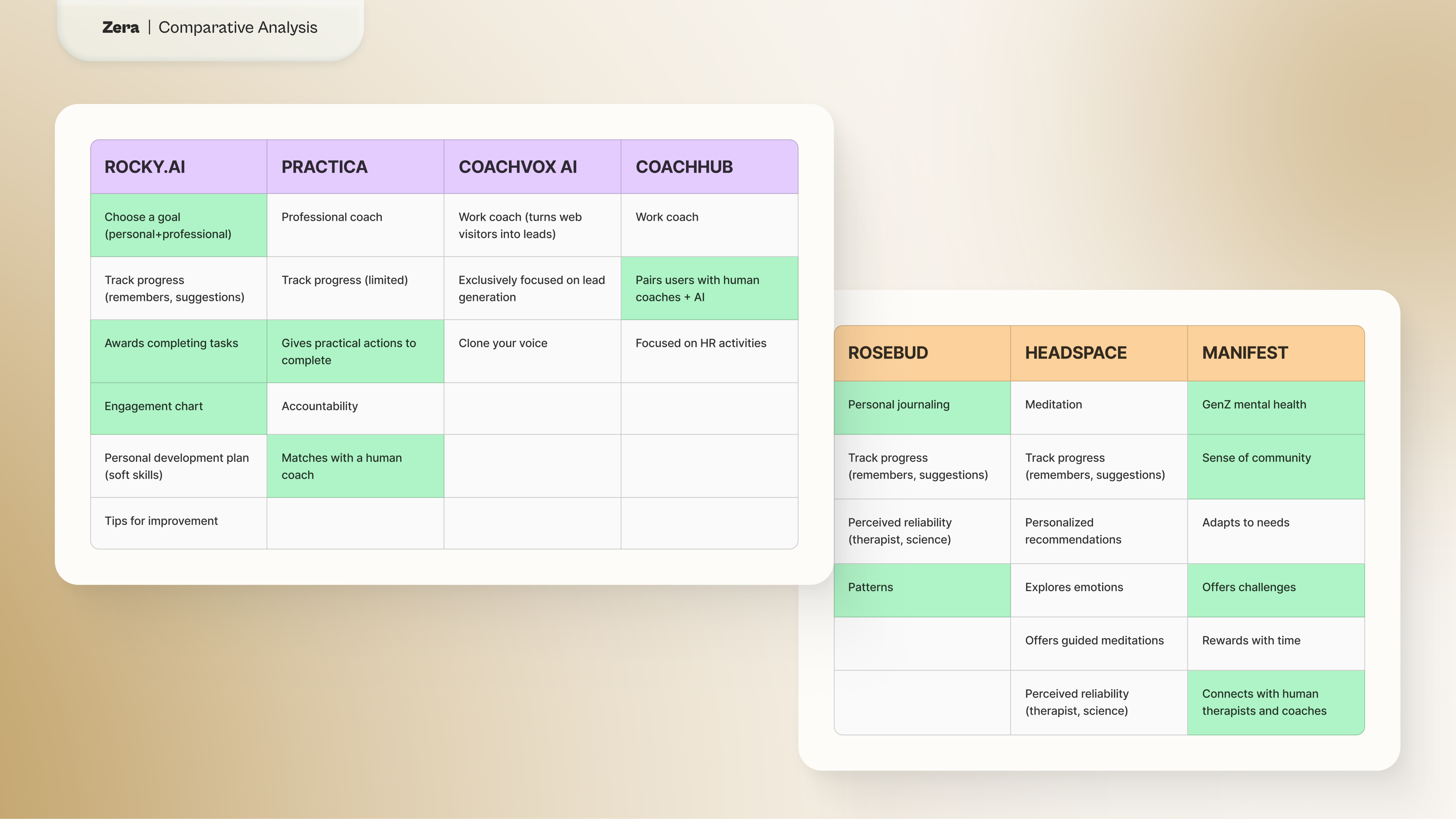
The research showed that this is a booming market which is why there are so many new apps for Life Coaching and Mental Health tracking. Among these products, some are more successful than others and a brief analysis showed that:
- The core offer remains largely the same across the board among the products considered between direct and indirect competitors.
- Direct competitors (Rocky.ai, Practica, Coachvox AI, CoachHub)
- Pair users with professional human coaches in support of the basic AI chat
- Offer practical and actionable tips to the user that they can collect and revisit at their own leisure
- Make use of a reward system to encourage users to come back
- Indirect Competitors (Rosebud, Manifest, Headspace)
- Focus more on mental health support with simple tools like journaling, finding behavioral patterns, and giving access to community chatrooms
- Minimize the use of AI to provide space for human interaction
Hypothesis
At this point, I was ready to formulate my hypothesis on how to fix these problems:
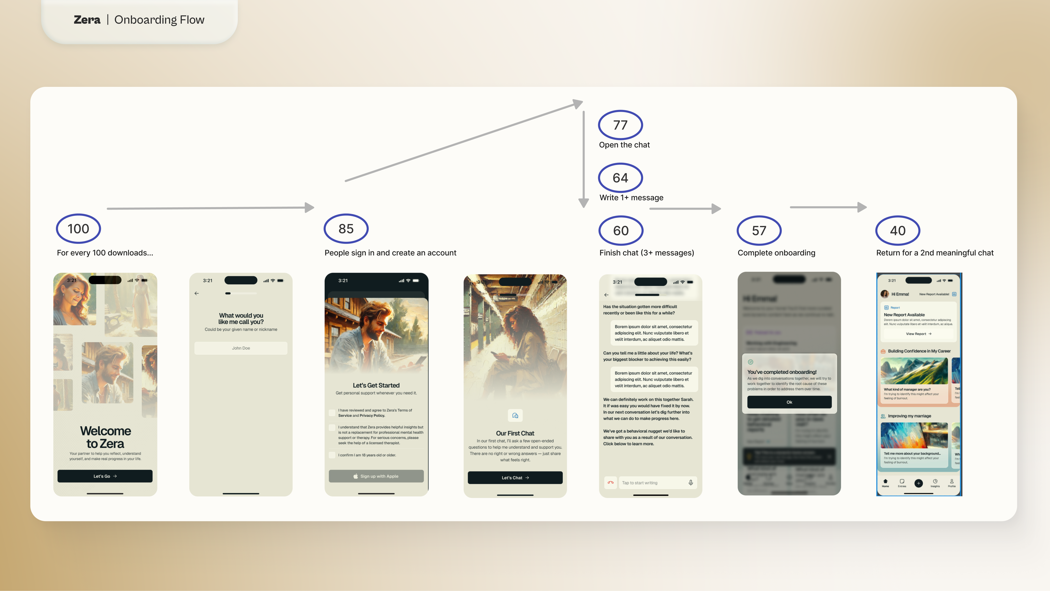
- Improve user retention by giving value to each conversation with the AI chatbot. The current user journey has a long onboarding where users are forced to have a first 5-minute conversation with the AI. After that, they have access to the app but they will not see reports until the 5th chat with Zera. Users either never finish the first conversation or never come back for a second chat. To solve this I proposed to:
- Shorten the onboarding process
- Give instant feedback at the end of each conversation
- Show a visual representation of what the user achieved with each chat
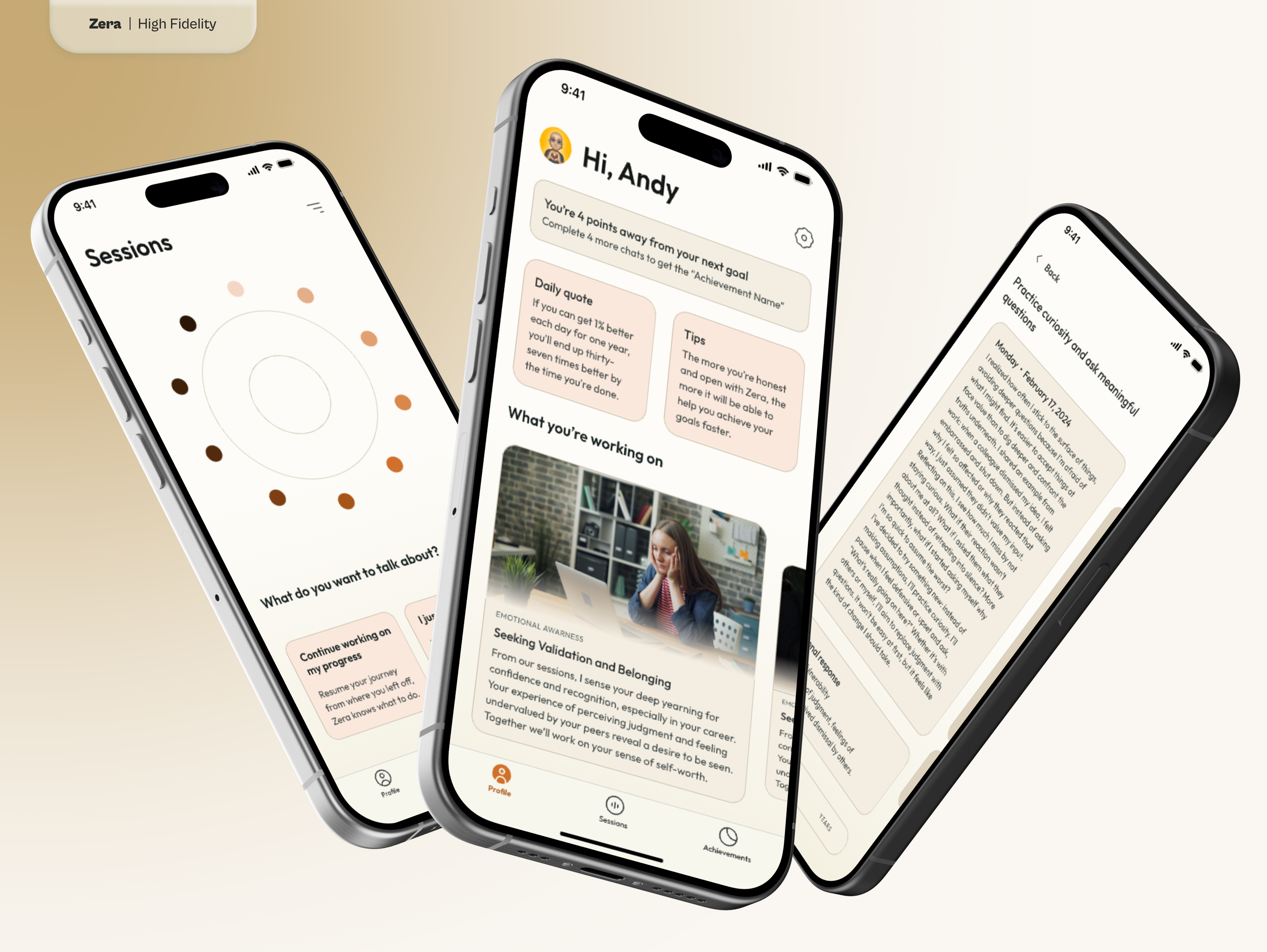
- Improve trust between humans and AI by making the AI more approachable.This was the most crucial issue: how to make a human feel a connection with a piece of tech. I got inspiration from Apple, a brand that perfects not just its products but the entire user experience in its stores. Every Apple Store is designed with intention, especially the display area with large wooden tables and devices ready to be picked up. This psychological tactic makes customers feel “bonded” with the products as soon as they take them into their hands: the more time they spend with it, the more intimate and personal this connection becomes, making them feel comfortable using that product as if it was already their own. I applied the same principle to Zera, transforming it from a chatbot to the entire app. Zera isn’t just a feature, it is the whole experience.
- The AI welcomes the users to start the onboarding process using voice messages to reduce the cognitive overload of the long texts used so far.The entire flow is now a disguise for the first chat with Zera: it engages with the users in small conversations of an increasingly personal nature to fill up their profile and creates a personalized plan for future conversations. This ensures that users have only a taste of the app but they need to come back to start their journey.
- Zera has a visual representation. Instead of being a chat with a disembodied voice, it now shows a visual element that reacts to the vocal cues of the answers provided by the AI. It gives a sense of someone (or something in this case) actively listening to the users' responses, making the process of sharing intimate thoughts and emotions more natural.
- Users can interrogate Zera on anything anytime they need help. However, Zera can provide coherent flows based on the users' issues in any aspect of their lives. These healing journeys have steps and milestones that will help users grow and gain "points" to complete the path they are on together with Zera. This helps give a sense of purpose to each conversation with the AI chatbot accompanied also by the small daily tips and quotes personalized for the user's journey.
Sketching
At this point, I had found a solution for the most difficult problems the client had. Now, I needed a way to put these in a cohesive visual form.
I decided to focus on three principles:
- The 1% Rule. It states that over time the majority of the rewards in a given field will accumulate to the people, teams, and organizations that maintain a 1% advantage over the alternatives. You don’t need to be twice as good to get twice the results. You just need to be slightly better.
- Full Circle. The idea of "coming full circle" means to change or reform over time. It’s the completion of a cycle of transition, returning to where one started after gaining experience or exploring other things.
- Awareness. The concept of awareness is the conscience of self in relation to ourselves and the world surrounding us. It is divided in:
- Environmental: the ability to focus on a specific sense, such as touch or sound, to remain present and observe both the surrounding environment and non-verbal communication. It enhances the recognition of unspoken emotions, stress, or discomfort through body language and tone of voice.
- Emotional: the ability to recognize and accept emotions, both in oneself and others, with openness and vulnerability. It helps prevent reactive responses and enables deeper reflection, meaningful discussions, and a better understanding of others' needs and challenges.
- Judgment: the ability to recognize and challenge one's own judgments, biases, and preconceived notions. It fosters more rational thinking, preserves curiosity, and enables deeper questioning, leading to more effective support and guidance for others.
- Ingrained thought patterns: the ability to recognize how personal beliefs and thought patterns shape one's perception of challenges. This awareness helps identify unhelpful assumptions and fosters deeper understanding, leading to more meaningful discussions and insightful questioning.
High Fidelity Prototype
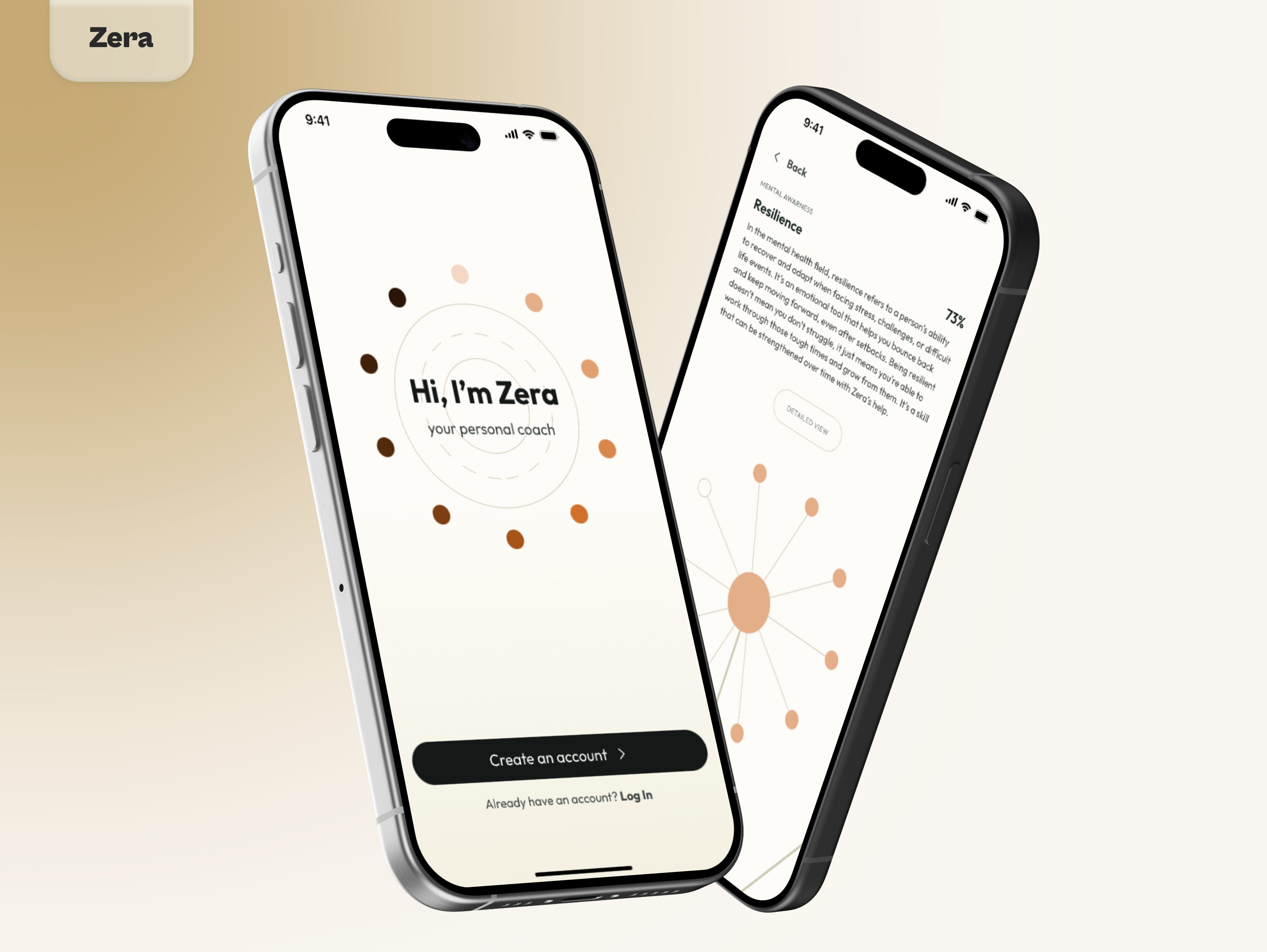
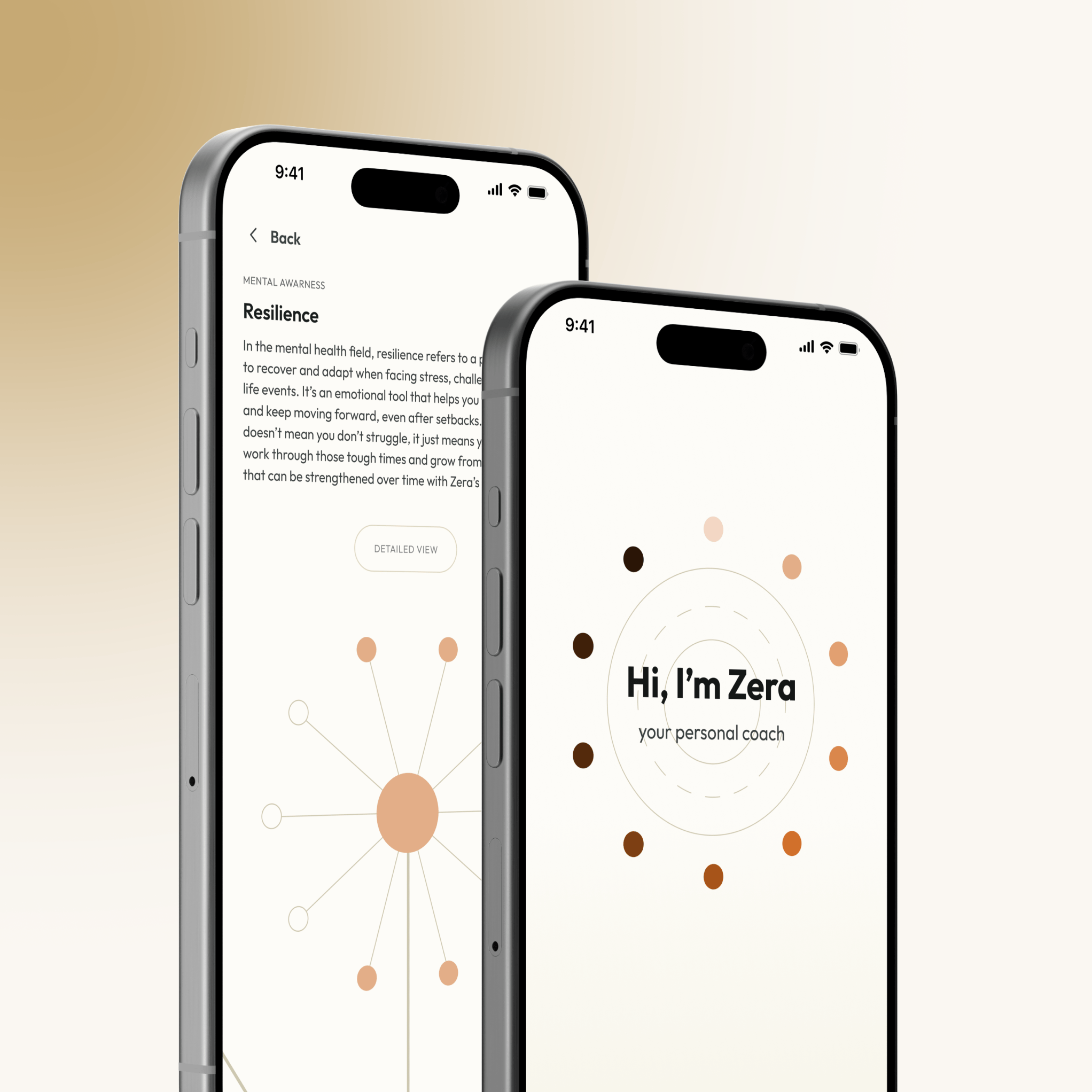
Using these principles as a guide, every element of the UI has a circular aspect from the font to the icons and corner radiuses.
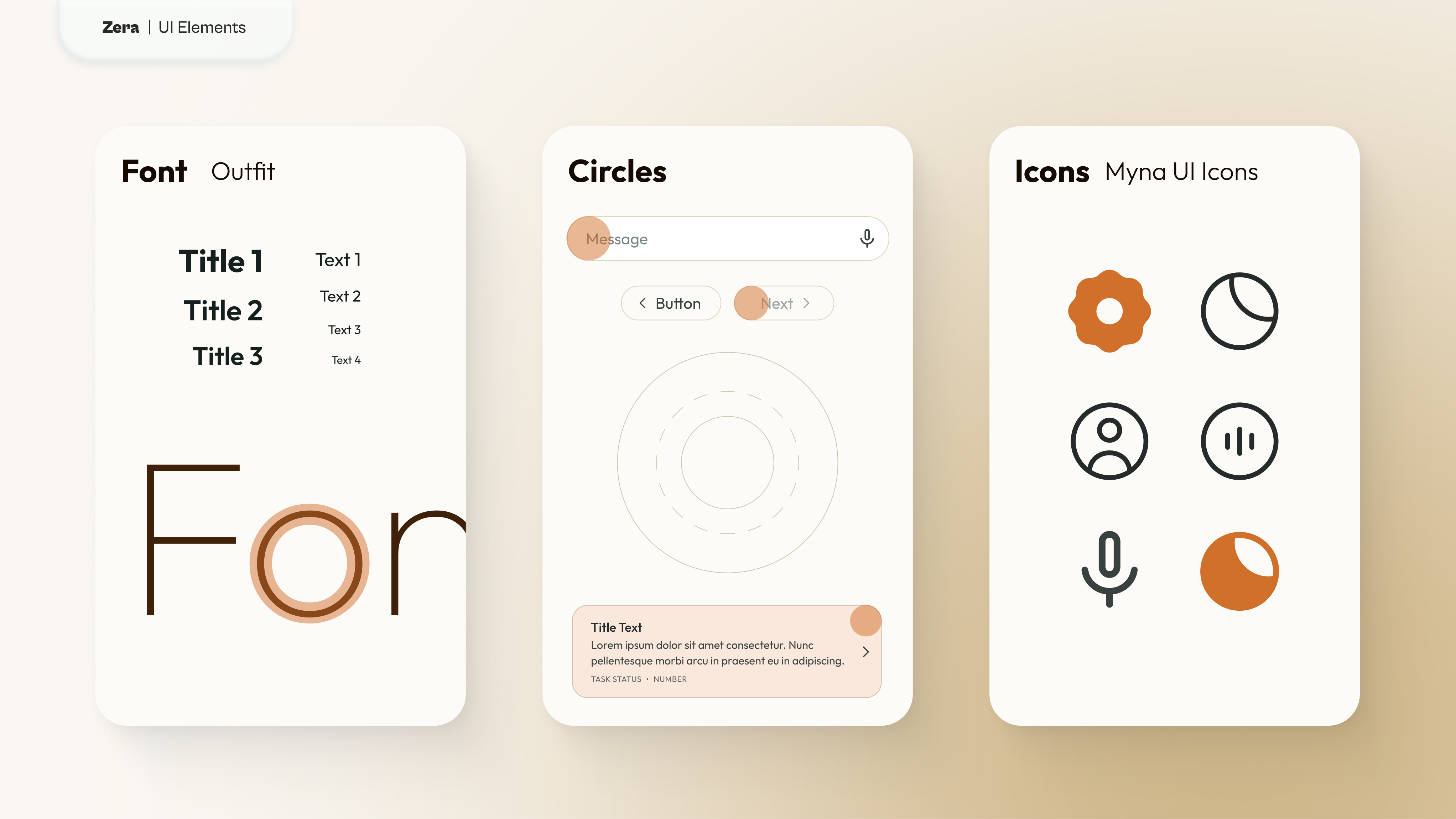
The colors used are a soft mix of browns to represent different skin tones. This expands the client's palette into an element of inclusivity: it indicates that no matter who you are or where you come from, we all face the same issues, and Zera can help us get through them together.
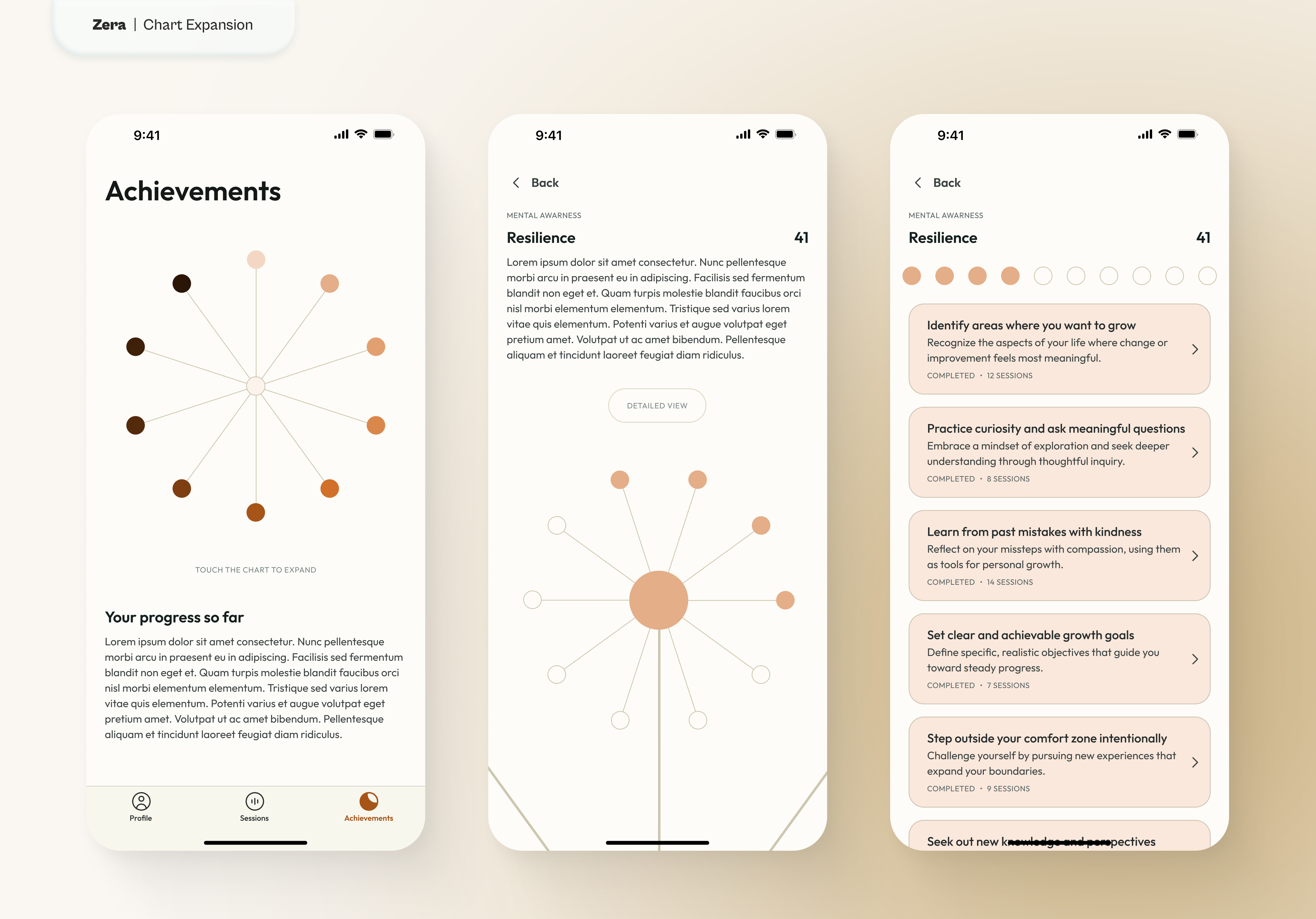
Zera's visual representation is a minimalistic series of circles. These elements morph depending on the screens: they're a progress bar during the onboarding flow, a chart showing the user's progress during their journey, and the visual cue of each voice session, moving whenever dialogue is detected. In every iteration, these elements represent a circle to complete to achieve a milestone that fills up 1% at the time.
Final Thoughts
At the time of writing, this project veered on a different direction following another designer's vision.
However, the core principle of giving value to the conversations with the AI has been retained in the current version of the app.
It would be nice to understand if their new design fixed the initial problems they had, and managed to retain users after the onboarding and bridging the gap between human and machine in their targeted audience.
Update: It is my understanding that after about four months from the redesign, the app was transformed into a generator of AI podcast about life coaching, which was eventually discontinued entirely not even a year later.
Zera
UX/UI Product Designer, Consultant
November, 2024
link
Overview
Zera is an app that offers AI-based life coaching sessions to help users grow in their personal and work lives, setting them free of what's stopping them from achieving their full potential.
Functioning as a UX/UI Consultant, I was offered the task of bringing the MVP of Zera to a refined UX with an appealing UI. However, the greatest challenge was making it appealing to a target audience that feels uncomfortable sharing private information with AI-powered products.
The Client
Zera, whose parent company is EdTech Games, is a vibrant start-up of young designers and developers based in central London. Their office is stacked to the brim with all the latest technologies and bigger-than-life ideas.
Their product, the app called Zera, is very promising on paper: bridge the gap between the need for life coaching sessions and financial constraints for those who need them with a simple AI-powered chatbot.
After receiving a substantial investment, they're ready to elevate the whole app and possibly make it mainstream.
The Project Scope
Making a big splash in the new world of AI apps promising to help people get a better life didn't come without challenges. It was my job to help them figure out how to proceed to make the app stand out.
Some users tested the MVP and the issues Zera faced were:
- A mind-blowing 60% abandonment rate after the first interaction
- A clunky user journey
- An AI model that wasn't bringing many benefits
Ideation
With only 3 weeks at my disposal, I had to move quickly to understand why users were not engaging with the app and its AI chat and figure out a way of retaining these first-time users to turn them into returning customers. At the same time, I also had to improve the overall User Experience with a more refined Interface.
Research
The client provided research they previously compiled. It included some basic information about the Life Coaching market, a couple of User Personas indicating their potential targeted clients, and three user interviews describing and evaluating their MVP.
This information was an incredible starting point but I felt some of the data was a little bit biased:
- Based on their market research, the client assumed that the every person in their target audience would be interested in this product
- The two Personas they created reinforced their assumption without any further investigation into the user base they wanted to approach
- The whole application and AI model was based on these assumptions
Target Audience
I decided to conduct my own research focusing in depth on what life coaching is, which types of people generally take advantage of that, and finally who confides more into AI products for these kinds of personal services like life coaching, counseling, or therapy.
Turned out that things were a bit more complicated than what seemed on the surface. First of all, I decided to investigate the Life Coaching market:
- As of 2020, the Life Coaching market has generated $1.4b in revenues.
- There are more than 71.000 Life Coaches worldwide, 67% of them are women.
- The typical clients of a Life Coach are women between the ages of 35 and 44.
- Generically speaking, women are more prone than men to seek help from a therapist, counselor, or life expert (74% against 36%).
I believe it's safe to assume that the target audience identified by the client is correct: women between the ages of 35 and 44. These data are in line with the user interviews they performed but these numbers don't quite add up. Why would these women interested in Life Coaching abandon the app after the first use?
So I figured the answer could reside in the next part of my research, people using AI. Knowing that women require Life Coaching sessions to help them most prominently to improve their lives at work, I focused on who are the people using AI for work-related problems:
- People working in AI rounds about 1.6 million, 78% of which are male.
- People using AI for work to improve their career in the broad age group between 18 and 65 years old are 59% male and 41% female. Of the latter, 68% admit using AI for "fear of being left out".
- Considering a younger age group between 18 and 25 years of age, only 22% of women take advantage of AI services for work, leading me to believe that the younger the users, the less they would be interested in an AI Life Coach product.
- This data, combined with the fact that more jobs related to women have been disproportionally replaced by AI, generates a sense of perceived bias and lack of trust in AI products, especially when it comes to personal matters and specific women's issues.
These answers led me to safely assume that women are not as interested in AI as much as the client believes.
So this is the answer to the client's problem: they are targeting the correct group of users, women in their 30s and early 40s, but the same age groups are the ones not trusting AI services to solve their issues.
References:
- theconversation.com - Women are less interested in AI than men
- forbes.com - More men than women use AI
- interface-eu.org - AI: the gender gap in AI pool
- lovepixelagency.com - Life Coaching statistics
Competitor Analysis
The research showed that this is a booming market which is why there are so many new apps for Life Coaching and Mental Health tracking. Among these products, some are more successful than others and a brief analysis showed that:
- The core offer remains largely the same across the board among the products considered between direct and indirect competitors.
- Direct competitors (Rocky.ai, Practica, Coachvox AI, CoachHub)
- Pair users with professional human coaches in support of the basic AI chat
- Offer practical and actionable tips to the user that they can collect and revisit at their own leisure
- Make use of a reward system to encourage users to come back
- Indirect Competitors (Rosebud, Manifest, Headspace)
- Focus more on mental health support with simple tools like journaling, finding behavioral patterns, and giving access to community chatrooms
- Minimize the use of AI to provide space for human interaction
Hypothesis
At this point, I was ready to formulate my hypothesis on how to fix these problems:
- Improve user retention by giving value to each conversation with the AI chatbot. The current user journey has a long onboarding where users are forced to have a first 5-minute conversation with the AI. After that, they have access to the app but they will not see reports until the 5th chat with Zera. Users either never finish the first conversation or never come back for a second chat. To solve this I proposed to:
- Shorten the onboarding process
- Give instant feedback at the end of each conversation
- Show a visual representation of what the user achieved with each chat
- Improve trust between humans and AI by making the AI more approachable.This was the most crucial issue: how to make a human feel a connection with a piece of tech. I got inspiration from Apple, a brand that perfects not just its products but the entire user experience in its stores. Every Apple Store is designed with intention, especially the display area with large wooden tables and devices ready to be picked up. This psychological tactic makes customers feel “bonded” with the products as soon as they take them into their hands: the more time they spend with it, the more intimate and personal this connection becomes, making them feel comfortable using that product as if it was already their own. I applied the same principle to Zera, transforming it from a chatbot to the entire app. Zera isn’t just a feature, it is the whole experience.
- The AI welcomes the users to start the onboarding process using voice messages to reduce the cognitive overload of the long texts used so far.The entire flow is now a disguise for the first chat with Zera: it engages with the users in small conversations of an increasingly personal nature to fill up their profile and creates a personalized plan for future conversations. This ensures that users have only a taste of the app but they need to come back to start their journey.
- Zera has a visual representation. Instead of being a chat with a disembodied voice, it now shows a visual element that reacts to the vocal cues of the answers provided by the AI. It gives a sense of someone (or something in this case) actively listening to the users' responses, making the process of sharing intimate thoughts and emotions more natural.
- Users can interrogate Zera on anything anytime they need help. However, Zera can provide coherent flows based on the users' issues in any aspect of their lives. These healing journeys have steps and milestones that will help users grow and gain "points" to complete the path they are on together with Zera. This helps give a sense of purpose to each conversation with the AI chatbot accompanied also by the small daily tips and quotes personalized for the user's journey.
Sketching
At this point, I had found a solution for the most difficult problems the client had. Now, I needed a way to put these in a cohesive visual form.
I decided to focus on three principles:
- The 1% Rule. It states that over time the majority of the rewards in a given field will accumulate to the people, teams, and organizations that maintain a 1% advantage over the alternatives. You don’t need to be twice as good to get twice the results. You just need to be slightly better.
- Full Circle. The idea of "coming full circle" means to change or reform over time. It’s the completion of a cycle of transition, returning to where one started after gaining experience or exploring other things.
- Awareness. The concept of awareness is the conscience of self in relation to ourselves and the world surrounding us. It is divided in:
- Environmental: the ability to focus on a specific sense, such as touch or sound, to remain present and observe both the surrounding environment and non-verbal communication. It enhances the recognition of unspoken emotions, stress, or discomfort through body language and tone of voice.
- Emotional: the ability to recognize and accept emotions, both in oneself and others, with openness and vulnerability. It helps prevent reactive responses and enables deeper reflection, meaningful discussions, and a better understanding of others' needs and challenges.
- Judgment: the ability to recognize and challenge one's own judgments, biases, and preconceived notions. It fosters more rational thinking, preserves curiosity, and enables deeper questioning, leading to more effective support and guidance for others.
- Ingrained thought patterns: the ability to recognize how personal beliefs and thought patterns shape one's perception of challenges. This awareness helps identify unhelpful assumptions and fosters deeper understanding, leading to more meaningful discussions and insightful questioning.
High Fidelity Prototype
Using these principles as a guide, every element of the UI has a circular aspect from the font to the icons and corner radiuses.
The colors used are a soft mix of browns to represent different skin tones. This expands the client's palette into an element of inclusivity: it indicates that no matter who you are or where you come from, we all face the same issues, and Zera can help us get through them together.
Zera's visual representation is a minimalistic series of circles. These elements morph depending on the screens: they're a progress bar during the onboarding flow, a chart showing the user's progress during their journey, and the visual cue of each voice session, moving whenever dialogue is detected. In every iteration, these elements represent a circle to complete to achieve a milestone that fills up 1% at the time.
Final Thoughts
At the time of writing, this project veered on a different direction following another designer's vision.
However, the core principle of giving value to the conversations with the AI has been retained in the current version of the app.
It would be nice to understand if their new design fixed the initial problems they had, and managed to retain users after the onboarding and bridging the gap between human and machine in their targeted audience.
Update: It is my understanding that after about four months from the redesign, the app was transformed into a generator of AI podcast about life coaching, which was eventually discontinued entirely not even a year later.